Nowadays it appears that scientists are working under the misguided assumption that data presentation must showcase the complexities experienced during research. Perhaps it is time to move away from this counterproductive mindset?
Communication is an integral and essential part of science, for without the dissemination of results, science is little more than a hobby. Indeed, the progressive nature of science is dependent on the communication of results. Yet, despite this, many people in science seem to think that data presentation is unimportant and that the data ‘speaks for itself ’.
It sometimes appears as if many scientists believe that the more complex and incomprehensible the data presentations are, the more scientific they are – just take a glance at the majority of scientific posters on the walls of the next meeting you attend. You will often see tables and graphs which fail to articulate any story, but rather simply act as repositories for the data collected.
BIG DATA, BIG PROBLEMS
According to Calvin Schmid, author of Statistical Graphics: Design Principles and Practices, “It is indeed strange – perhaps even incredible – that social scientists and statisticians who would be outraged by ungrammatical sentences, misspelled words, or even improper punctuation, are so indifferent, if not actually receptive of, crude, clumsy, and amateurish charts”[1]. This is very unfortunate, as science involves data, data means numbers, and numbers are best understood using tables or graphs. A well-designed data presentation can explain the main theme or story of even very large and complex data sets.
The advent of the big data era will only exacerbate this problem as the huge amounts of data that will become available will make interpretation even more challenging. As poorly conceived and executed tables and graphs can actually prevent an understanding of the aims and conclusions of a publication, we will need to pay greater attention to the presentation of data to avoid being swamped under by the incoming deluge promised by big data.
GUIDING PRINCIPLES
In a departure from the misled motivations already expressed, there are undoubtedly principles of good data presentation which can, in turn, help us utilise them to communicate. First up: tables. There are of course, lots of small things that can improve a tabular presentation, but the main tenets can be summarised as follows:
- Every table should have a message
- Do not add data that is not relevant to the table just because you have it
- Put numbers that are to be compared next to each other (to show the message) and not at opposite ends of the table
Of course, all three of these principles require one to know the main message of the data. The simple next step is to ask: what question do these data answer, or why were these data collected in the first place? Thus, safety data in a clinical trial answers the question of whether a treatment or intervention is safe, compared to a placebo or an active comparator. Patient demographic and baseline characteristic data in a comparative trial answer the question of whether the treatment groups are comparable for demographics. As a consequence, any discrepancies observed in the trial can be attributed to the difference in treatments. From experience, when presented with data from a trial, people often begin looking at it in detail before determining what the question actually is – needlessly complicating the message, if not completely missing it.
VISUAL MASTERPIECE
Graphic presentations (line graphs, bar charts, scatter plots, pie charts), as a result of their intrinsic diversity, are more complex, and yet the same three principles of good presentation still apply. Many graphs become hopeless masses of lines, data points, or a blizzard of colours in an attempt to present every single data point, rather than the actual message itself. A particularly good example of this is the near ubiquitous scatter plots seen in publications and scientific posters. Many appear as simple clouds of coloured dots, often with several colours representing different study groups all in the same plot, with no way to compare or make sense of the data. All that is needed to make a scatter plot comprehensible and convey a message is to add regression lines or the mean averages. The aim should always be to produce a clear display that quickly communicates the answer to the fundamental question of why the data was collected in the first place.
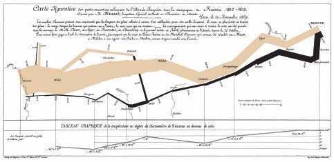
Figure 1: Map representing the losses of French army troops during the Russian campaign, 1812-1813.
The number of men present at any given time is represented by the light brown line, 1mm indicates 10,000 soldiers. Figures are also written besides the lines. Light brown designates soldiers advancing into Russia, black for those retreating. Sources for the data are the works of Thiers, Segur, Fezensac, Chambray, and the unpublished journal of Jacob, Temperatures for the retreat are indicated in the line diagram below the main map.
A classic and oft-cited example of this is the Charles Minard graphic of Napoleon’s invasion of Russia in 1812 (see Figure 1), dubbed by Professor Edward Tufte of Yale University, “[as] probably the best statistical graphic ever drawn”[2]. Although this statistical graph contains thousands of data points (numbers of troops superimposed on a two-dimensional map of Russia), the message is clear within an instant; it beautifully conveys the magnitude of what is widely considered to be one of the greatest military catastrophies of all time.
GRAPHICAL ABSTRACTS
A recent development in scientific publishing even suggests that good data presentations which clearly display the main message may soon be required for publication. A number of scientific journals have begun requesting that graphical abstracts be included when a manuscript is submitted to a journal. According to the Elsevier For Authors website, “A graphical abstract should allow readers to quickly gain an understanding of the main take-home message of the paper and is intended to encourage browsing, promote interdisciplinary scholarship, and help readers identify more quickly which papers are most relevant to their research interests. Authors must provide an image that clearly represents the work described in the paper. A key figure from the original paper, summarising the content, can also be submitted as a graphical abstract”[3].
SCIENTIFIC POLITIC
Hopefully this excellent idea will spread throughout the world of scientific publishing, and perhaps even extend to conference posters. If the use of well-designed, clear, infographic-type displays of scientific information becomes widespread, it will greatly facilitate and increase the communication of scientific results, with the potential to hasten the pace and value of scientific discoveries. Given the range of environmental and technological threats the world currently faces, this is surely something we can all support.
REFERENCES
- Schmid C, Statistical graphics: Design principles and practices: p2, 1983
- Tufte E, Visual display of quantitative information 914: p40, 1983
- Visit: www.elsevier.com/authors/journal-authors/graphical-abstract